Background
My experience as a product design intern at PlanGrid was quite different than previous design internships I’ve had. I was working on making improvements to an already established product on the app called ‘Field Reports’, which involved more user research and feature prioritization than I had been exposed to. This case study will walkthrough a few features that I worked on, and more importantly why it improved the overall Field Reports experience on the app.
A field report is typically used in construction to record information on a job site. Field Reports is a section on PlanGrid that also allows similar behavior in a digitized form. This section of the app has two options, one of which is the ability to upload a pdf of an existing field work record document that the construction company uses, while the other is to use Field Report’s Native Report.
Discovery and Goals
One of the primary goals in addition to improving the overall usability of Field Reports is to increase the use of Native Field Reports among customers, rather than them choosing to upload a PDF of their own. This allows for more data collection and cross integration for other PlanGrid products.
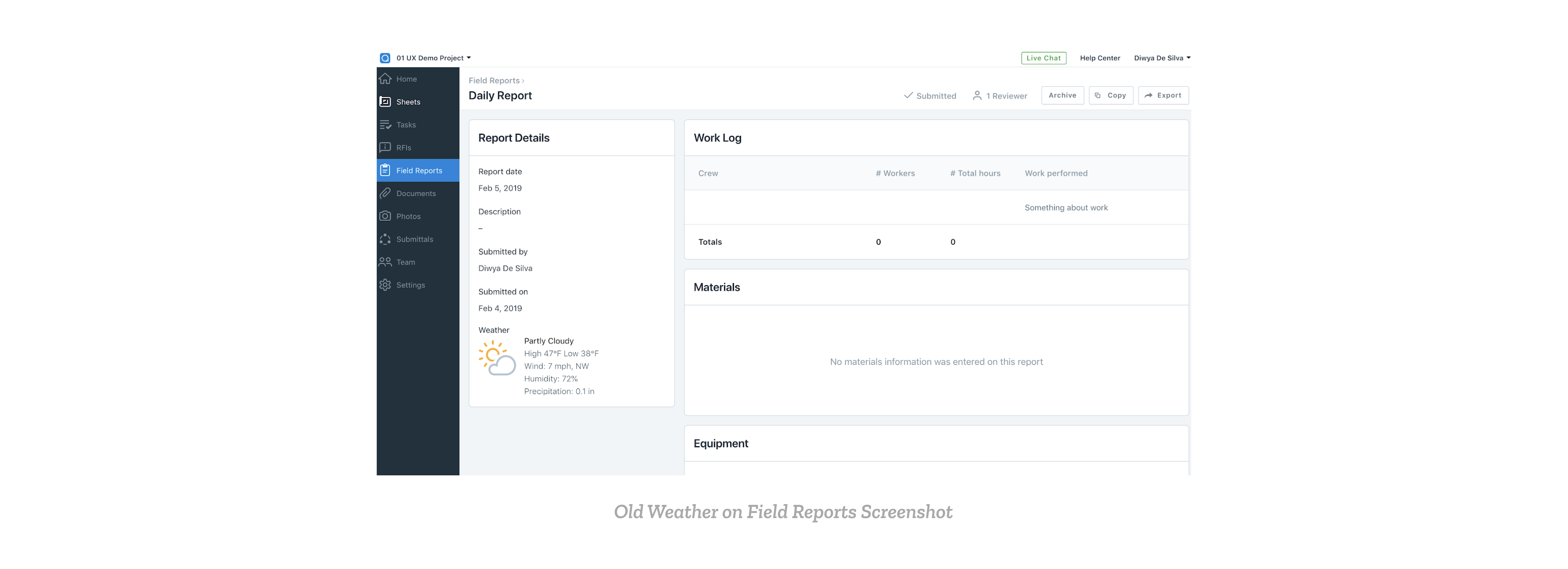
Zendesk is a common ticketing tool used to gage what customers request for Field Reports product. It was discovered that one of the most requested feature items to be improved on since its initial release in 2017 is weather on Field Reports. An image of the old weather on Field Reports is shown below.
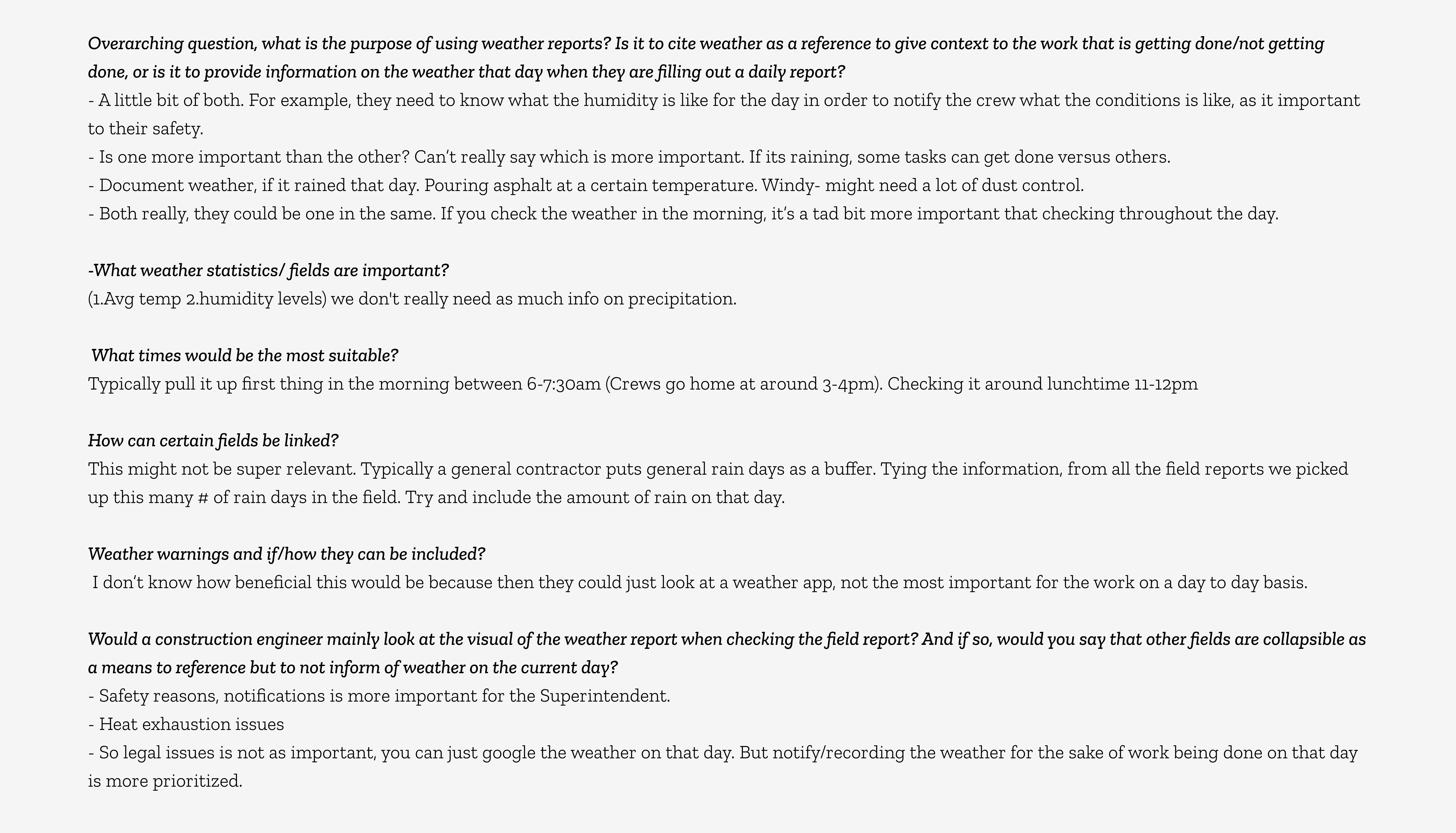
Users asked for more detailed information on how Weather impacted a construction site, specifically for “three time a day” weather on Field Reports.
If you could notate the weather throughout the day….. so if its sunny in the morning when you start your day, and turned to rain in the afternoon, it would be helpful to be able to log in and update weather…..
Can you input multiple weather snapshots into a daily report…like at different times during the day
Hi, is there a way to get a three time a day weather report?
Design Process
Collecting user comments and feedback allowed us to define a general problem statement:
How might we better show the impact of weather on a construction site on a daily basis?
This question became the lens through which I looked at my designs, and expanded into other questions that began my user research.
Research
Being relatively new to the construction problem space, I wanted to gain a background on how weather can impact a construction site. I began my research through existing documents already found on PlanGrid or online on the impacts of weather. Some of the impacts I found were:
- By decreasing productivity and sometimes halting construction
- By ruining unprotected and exposed constructed elements
- By disrupting communications and/or blocking access to site locations
- Moreover, weather-related claims are a frequent source of dispute between contractors and project owners
- By providing poor conditions and concerns for safety for crew members
After gaining some background knowledge, I decided to interview Customer Advocates (CA’s). CA’s are people employed by PlanGrid with a construction background that can provide more in-depth knowledge on what the practices and pain points a user may go through on the field.
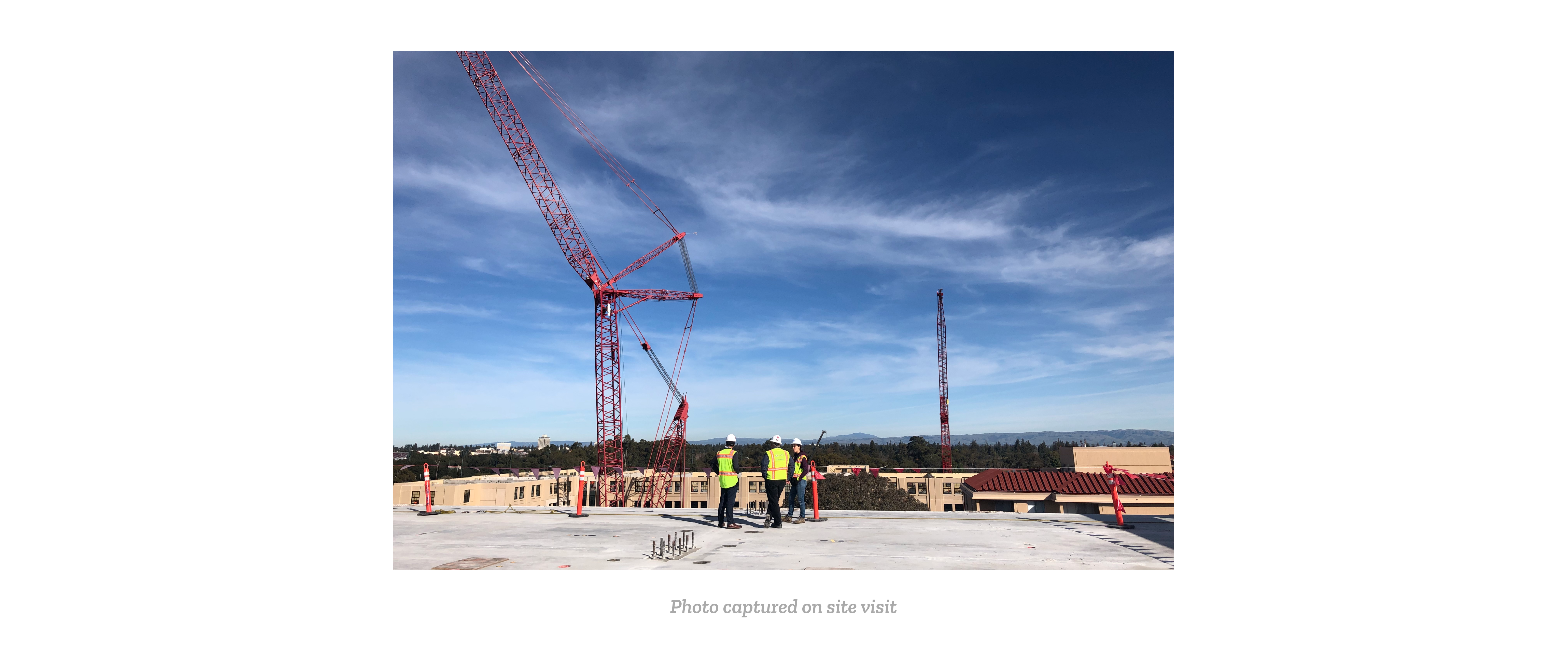
During a site visit, I also got the opportunity to talk to a Field Manager on who frequently checks Field Reports during the end of a work day. Some of the most notable things mentioned were:
- Yes they need progress of weather throughout the day
- Temperature – is important. For example there is a specific temperature range needed for grout. Safety concerns is a priority if weather is too hot.
- Rain/precipitation: Can cause delays, no work gets done (it is needed)
- Wind conditions can also be very important since they can impact material handling and crane picks greatly on the job site.
Many ideas came to mind after hearing the requests and concerns by customer advocates, but I knew it was important to check with the engineering team to determine the feasibility of some of their requests. For example, the API e were planning to use was DarkSky, so I began my research on what weather statistics the API was able to provide. This lead to the following chart created below:
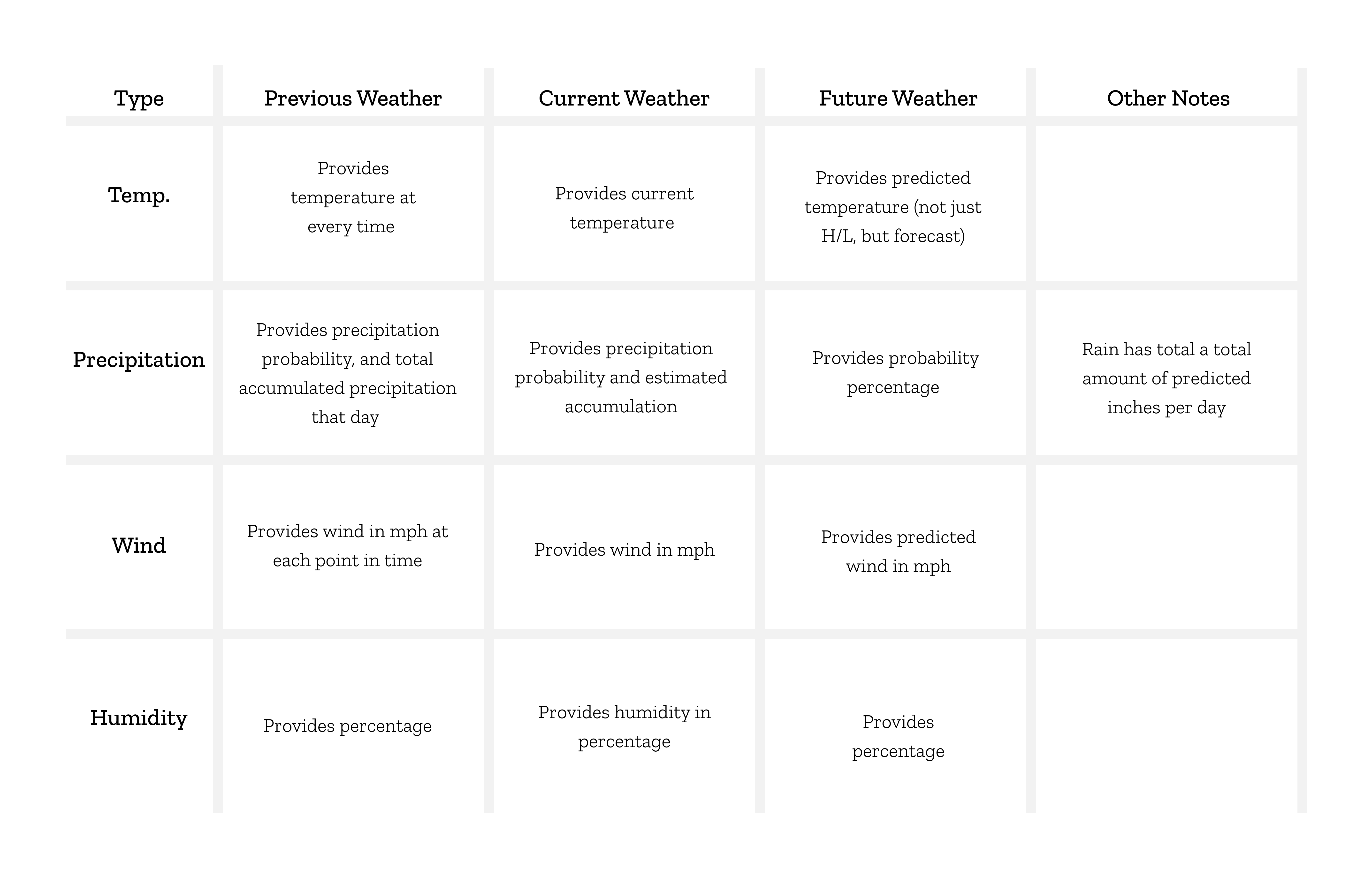
This allowed me to come to the conclusion that precipitation should be shown as estimated accumulation followed by actual accumulation on a Field Report, as it was not simple or practical to show accumulation in chunks of time as the API does not support it.
Synthesize
I then synthesized all the feedback I received from customer advocates and the engineering team into the following table which highlights the feature requirements, things that were considered but not included, and items that customers would want but were too complex to implement for this new iteration of weather on Field Reports. This table allowed everyone on the team to better understand the scope of the project, and gave me a clear plan as I began the UI mockups.
Design Iterations
When designing UI mock-ups, these are the four steps I took:
Step 1: Look at what competitors are doing for our feature, and other similar UI patterns
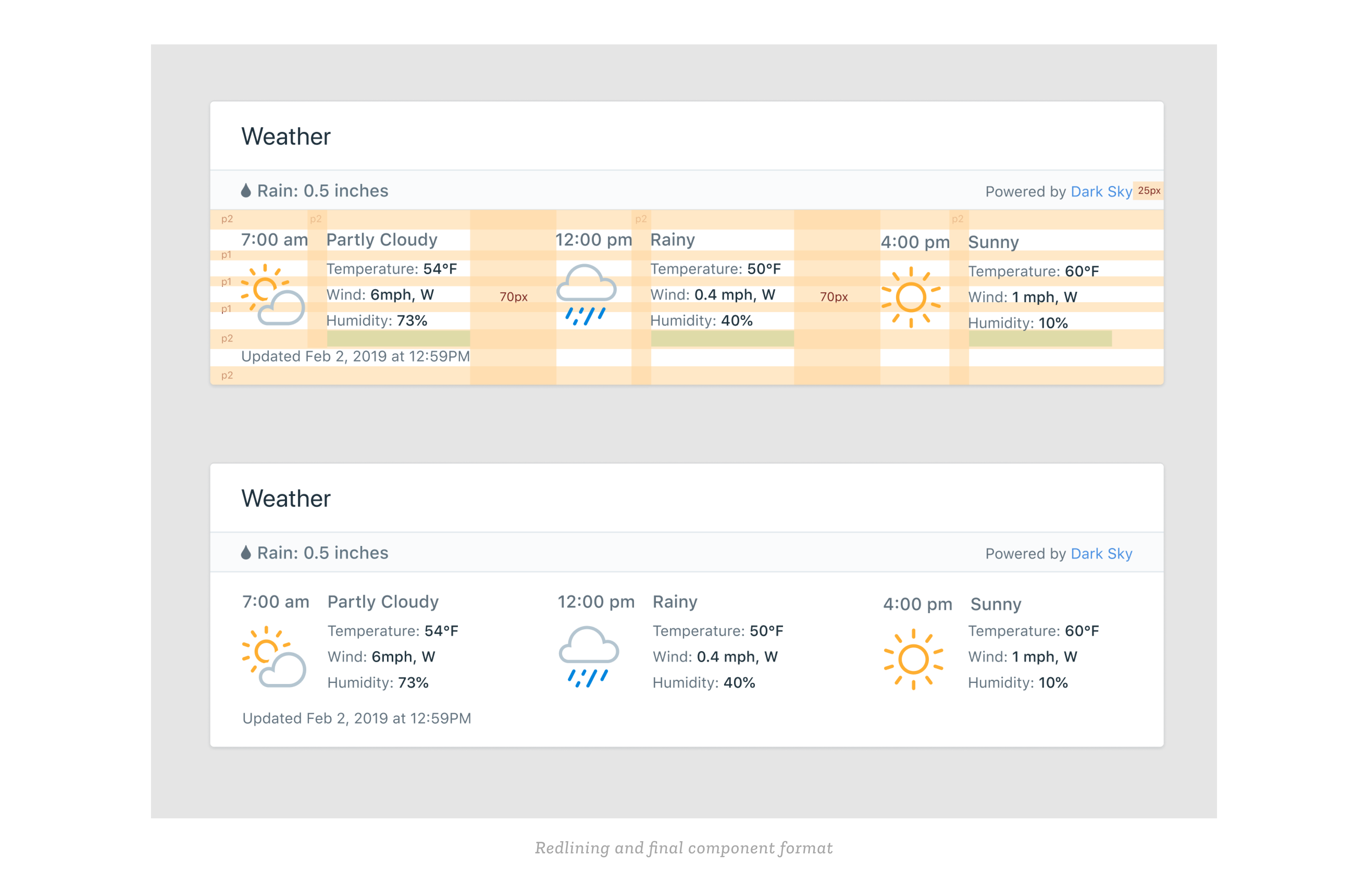
Step 2: Look at what’s currently on the design system to get more context on the visual style decisions made prior, and create new assets I may need for this feature
Some of the illustrations already existed in the PlanGrid design system from other past projects. I had also created new ones later on such as the grey raindrop and snowflake, in order to provide symbolization for the precipitation field.
Step 3: Draw some low-fidelity mockups to provide myself a general outline on how organize information
Step 4: Create hi-fi solutions, get feedback from designers, engineers, and the product team and continue to iterate until we reach a final design for MVP
One of main design decisions/challenges I faced during this project was where to place the actual Weather component. In terms of hierarchy, the ‘Worklog’, ‘Materials’ and ‘Equipment’ section of a Daily Report are far more important than Weather. This would lead to placing the component in the column view as shown in the left wireframe. However, one of the main reasons why Weather is included at all is because it provides context for the ‘Worklog’ which leads us to placing it above the ‘Worklog’ in terms of visual hierarchy. Another downside to the column view is that being below the references section pushes down the ‘Weather’ component as people add more image/task references. Because of these reasons, I came back to the original problem statement of this feature: How might we show the impact of weather on a construction site? which lead to choosing the header version, as it prefaces all the other events that were recorded in order to provide the context of weather day to day.
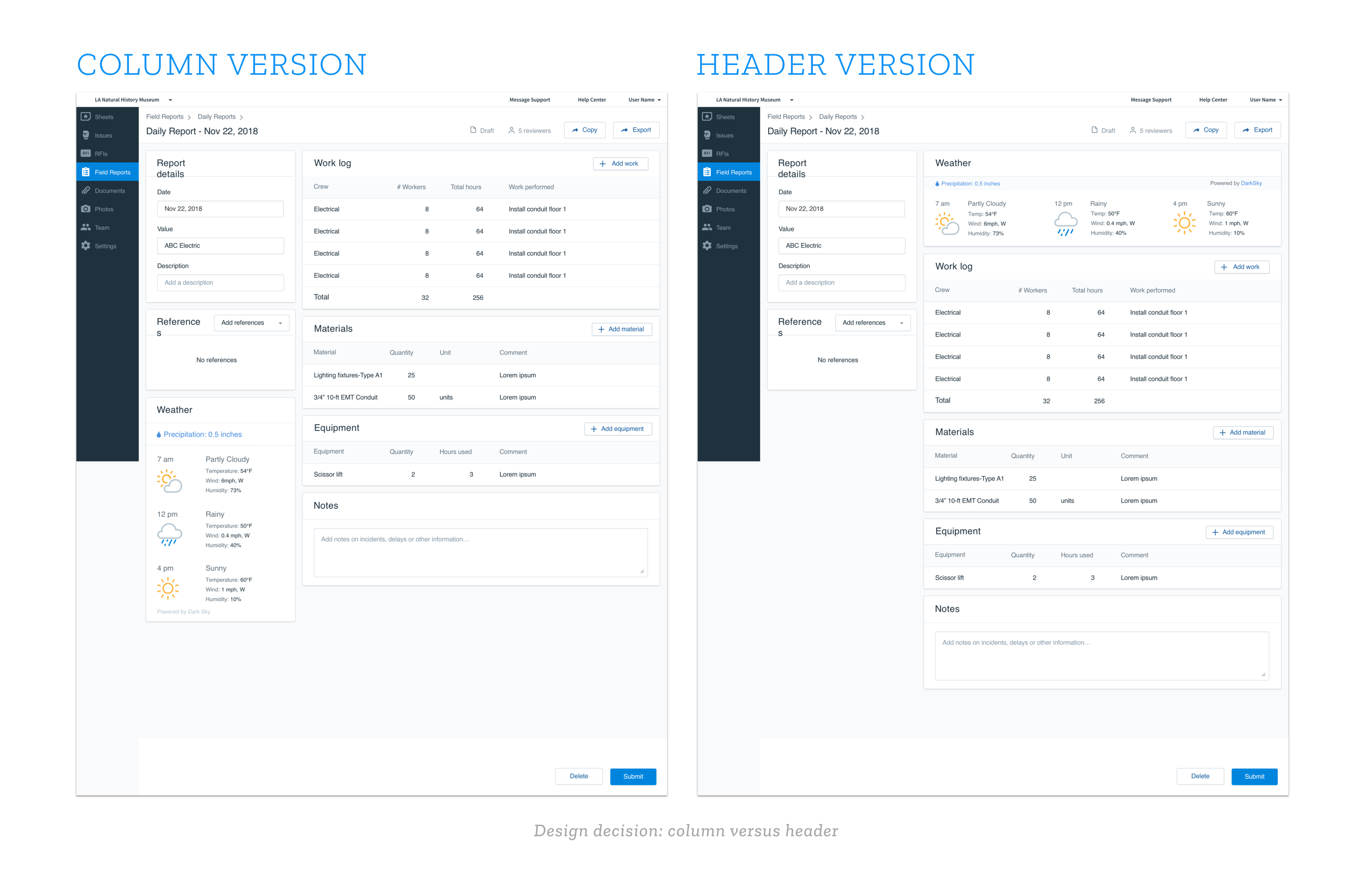
A piece of feedback that I received from the mobile engineering team was to keep the same weather component/placement of weather fields the same for iOS and Android. This was not the original design as it allows more white space on the right hand side than intended, but having an easier implementation process was one of my priorities, as it did not effect the overall readability.
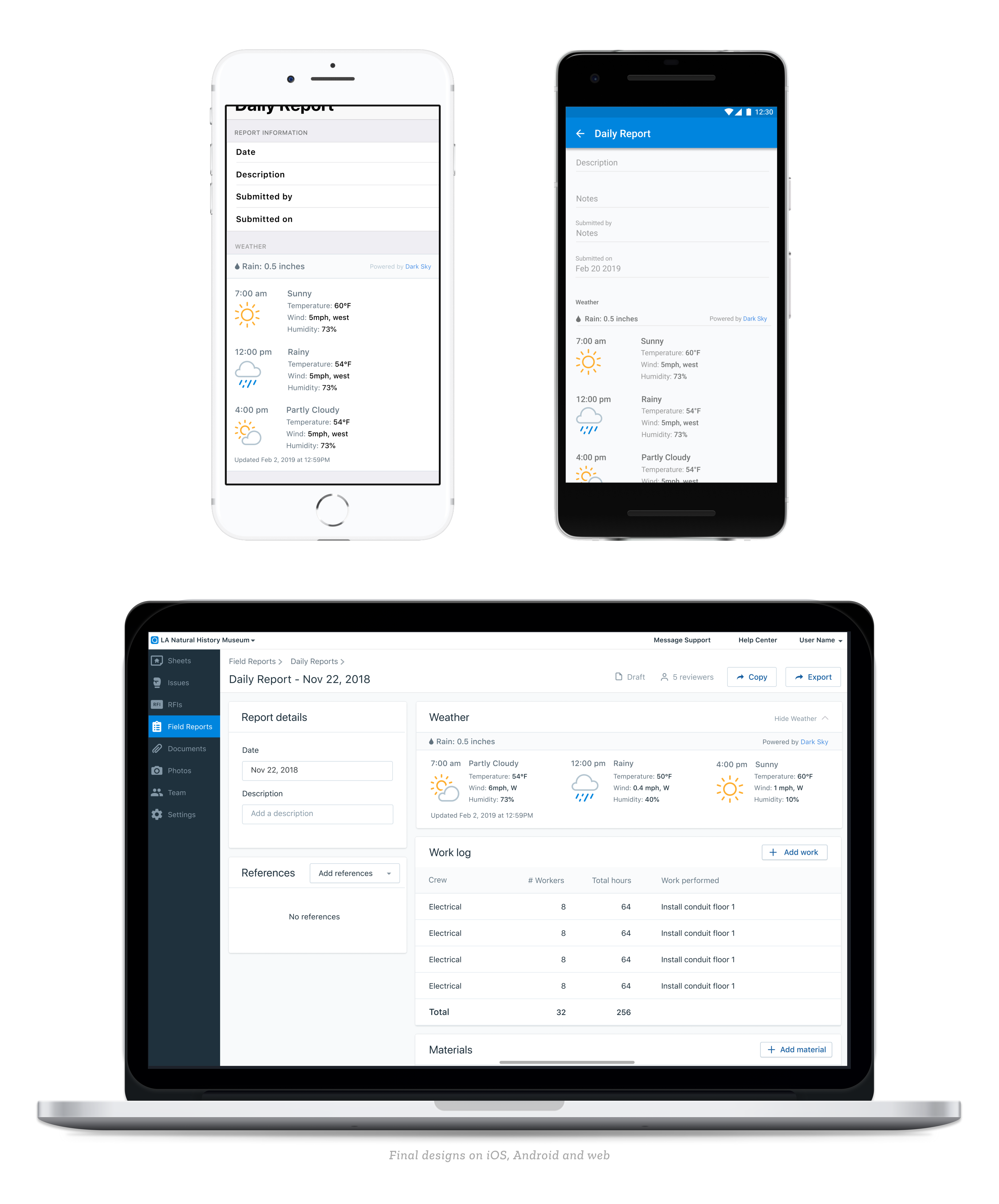
Final designs are shown below and currently released on the PlanGrid app!
Next Steps
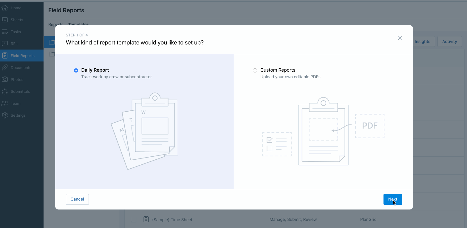
Something really valuable that every PlanGrid product team does is validate their design decisions through frequent user testing. I got to do a couple of user testing sessions validating a previous information architecture change. During that testing session, I also noticed that the user was having trouble finding the “Next’ button in the modal, as the modal height was too big for their smaller screen size.
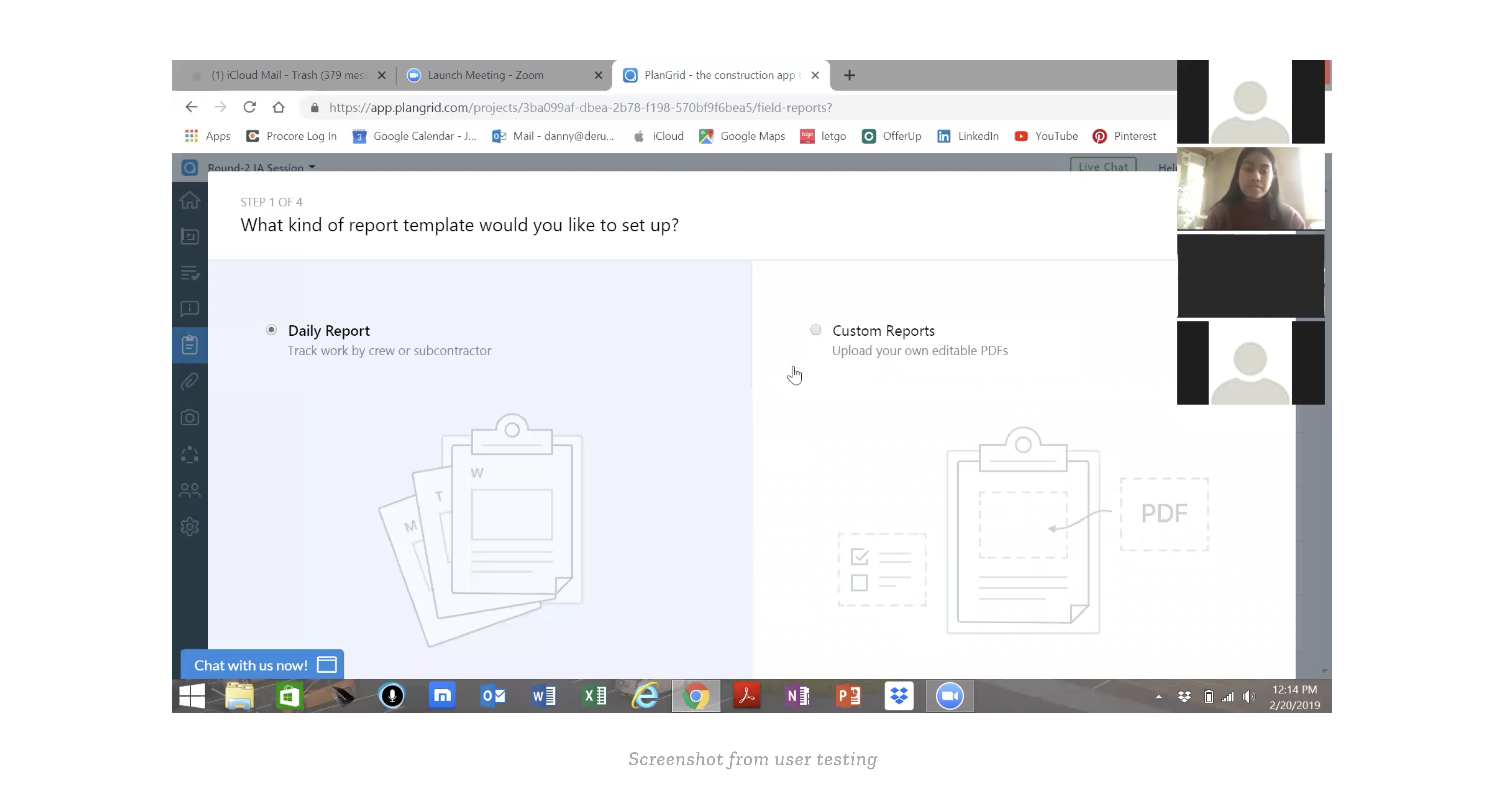
As a result, during the time where I was adding the weather component to this modal, I also tried to fix the modal height. The new flow can be seen in the following GIF:
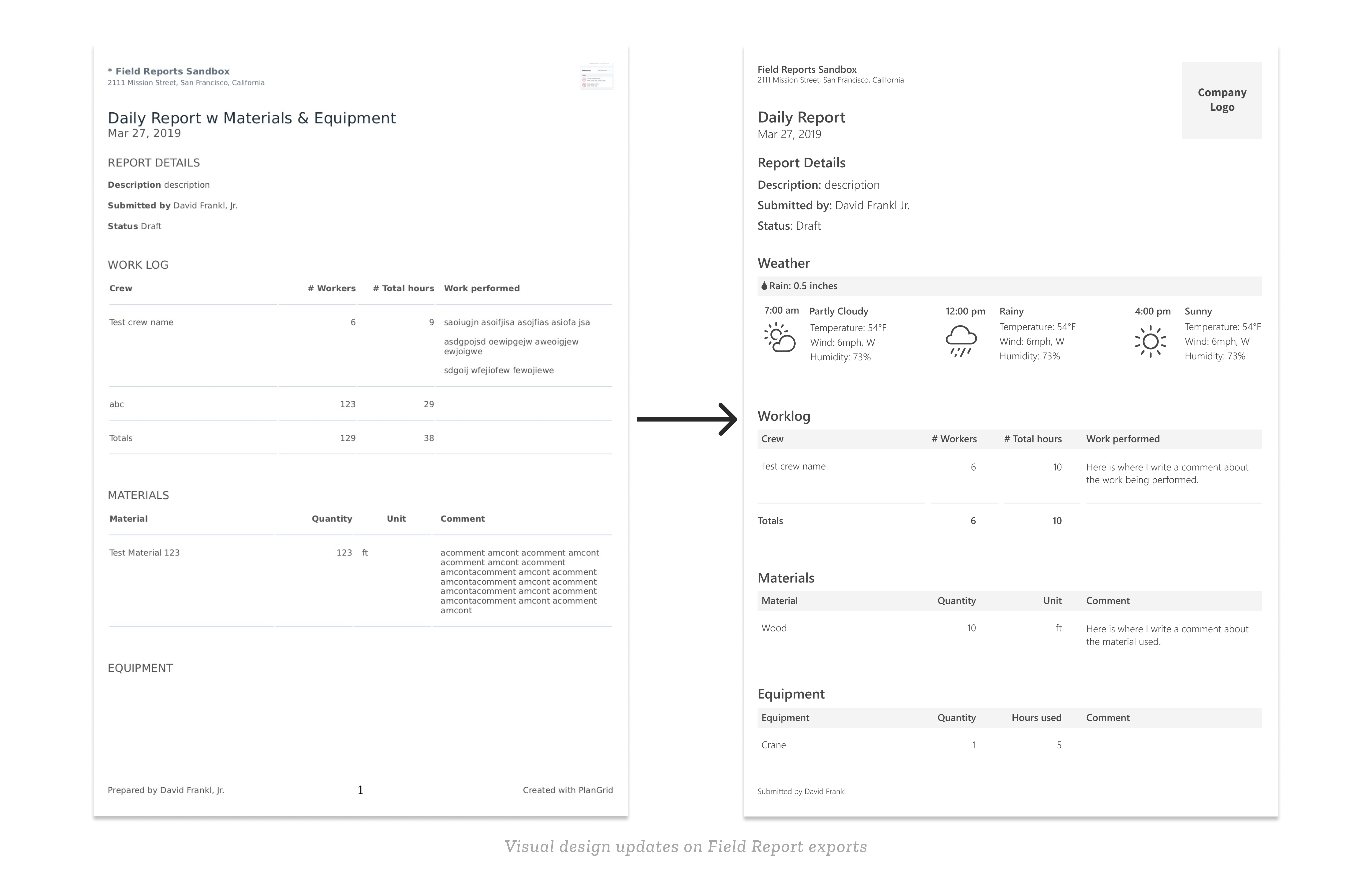
Along with making changes to the actual UI design, I also got to try more of print design. A use case of Field Reports common among project managers is that they like to print their report to bring to meetings. Similar to how there were many Zendesk comments asking for a more detailed view of weather on a Field Report, there were also comments asking for a better visual design on the actual print version. This extrapolated to another project I worked on where I tried to improve the exporting process and unify the design of printed reports on PlanGrid. That case study will be coming soon, but for now here is what the improved print version of a Field Report looks like, with weather added to it:
Key Learnings
Constant feedback is important, whether that is with research, design, or the engineering team. It saves a lot more time if one can understand the feasibility of there design ideas and what is prioritized among the product team as a whole, before beginning hi-fidelity design solutions.
Always look for opportunities outside of my current design project or work to improve the product as a whole. Looking at user metrics and feedback or doing user testing is how I discovered opportunities such as reducing the modal height and improving the appearance of an exported report, which allowed me to better the product at a larger scale.
Finally, when having difficulty with a design decision always go back to the “Why?” of the project. The problem statement: How might we better show the impact of weather on a construction site on a daily basis? was the lens in which I conducted my design process, and became a useful guide whenever I had to make any design decisions.