Background
During my design internship with TD's Innovation lab I learned and performed the Double Diamond design process.
Problem
TD Canada Trust's Student Lines of Credit (SLOC) were not being opened in comparison to other Canadian banks, even though they led the market share in student and youth accounts. The business goal was to increase the popularity and opening of SLOCs, which are lines of credit that a person can create if they are going to a post-secondary institution in Canada. However, they did not want the growth of their product to be from advertising. Instead, TD’s innovation lab was given the task to promote its growth through a digital, interactive experience.
Empathize
Following the first step of the double diamond process, our first step was to learn about the users that we wanted to target. One way to do so is to create personas based on qualitative and quantitative data. The personas that we made were for different potential user types, including a highschool student, a university student, a graduate student, a parent with children in highschool, a parent with children under the age of 13, and a TD bank employee. An example of a highschool student persona is shown below:
Highlighted in green are the user responses that were taken from surveying each separate persona type. For example, we learned that most highschool students spend about 3 hours researching their funding options, and most believed that their parents or OSAP are the most trustworthy options to accept funding for their post-secondary education. Prior to the survey, I held the assumption that there is a stigma around taking a loan from a bank in comparison to taking a loan from the government, even though they are essentially the same. Many of my assumptions were confirmed with this survey and demonstrated with the personas.
Define
With the help of personas and our user surveys, we were able to identify the main problem for our target users and develop a problem statement:
How might we build an experience for people that will explain how students can best fund their education?
This problem statement became our 'lens' that our team would refer to when coming up with design solutions.
Ideate
Our next step was to ideate on solutions for this problem statement. This involves diverge into as many ideas as we can think of and then converge into what seems realistic given our timeframe and budget.
One of the key things that we did was run a workshop filled with different ideation exercises for stakeholders. Some of the activities were meant to be ‘ice breakers’ where the stakeholders are taught not to filter their ideas, also know as the ‘Wishing’ exercise. One of the most important ones we did was called ‘Assumptions’.
Assumptions Exercise
In most industries and team project experiences, there can be a set of unspoken, deeply-held beliefs within a group that everyone is supposed to think or follow. If these assumptions are not acknowledged in the beginning of the design process, it can disorient a group and prevent us from suggesting new ideas and areas to improve. In this technique, TD stakeholders generated an assumption based on each of the following topics:
- The product we're building
- The users of the product
- The client (TD partners)
- Team roles and responsibilities
After these assumptions were written down, we looked at commonalities in each topic and derived a list of themes from them with the method of affinity mapping. This list was then presented and approved by those involved in the exercise as well as questioned in order to understand why we assume certain ideas.

Customer Journey Exercise
Our assumptions exercise helped with writing guiding principles for the product. The customer journey exercise seen below was done to focus on how a typical user would learn about a financial product, as that is the digital experience we were planning to make.
After completing these exercises, we began actually designing solutions. From the surveys and personas we decided to do a desktop application rather than a mobile application that would help people learn how to fund their post-secondary education. Our first idea was a traditional website that would have a section to learn about different funding methods, budgeting tools, and what TD can offer:
We did many different user interface designs of this idea. However, we also wondered if this would be an engaging experience or just another informational website that no one goes to. In result we began re-thinking our approach. One of the problems that we also encountered when analyzing our personas and surveys was that people did not know where to start when researching. I began asking myself these questions:
How could we make the digital experience more personal? (for each persona)
What are some digital trends that we can implement?
What is an engaging way to teach people this information?
After researching and thinking of answers to these questions, my mentor and I came up with the idea of having a conversational/chat-bot like interface where you can choose your ‘persona’ and have questions directly related to things you may want to learn based on the user base. This provides a solution to making the experience more personal, adds a new innovative twist to learning information, and is something that many websites are implementing for users to ask questions about a product or service.
We didn’t have enough resources to create an actually chatbot with natural language processing, so instead we created one that allows the user to select their response similar to a guided pathway. See this link for what we used as inspiration: http://uxchat.me/
The following interface designs are past ideas that we had following a traditional chat-like interface:
Prototype
The final design we decided to build prototypes for are displayed below. Some key visual design changes include moving to a larger chat bubble layout because we did not want to give off the impression that it was a live chatbot but rather a combination of an informational website and a chat-like interface.
Testing
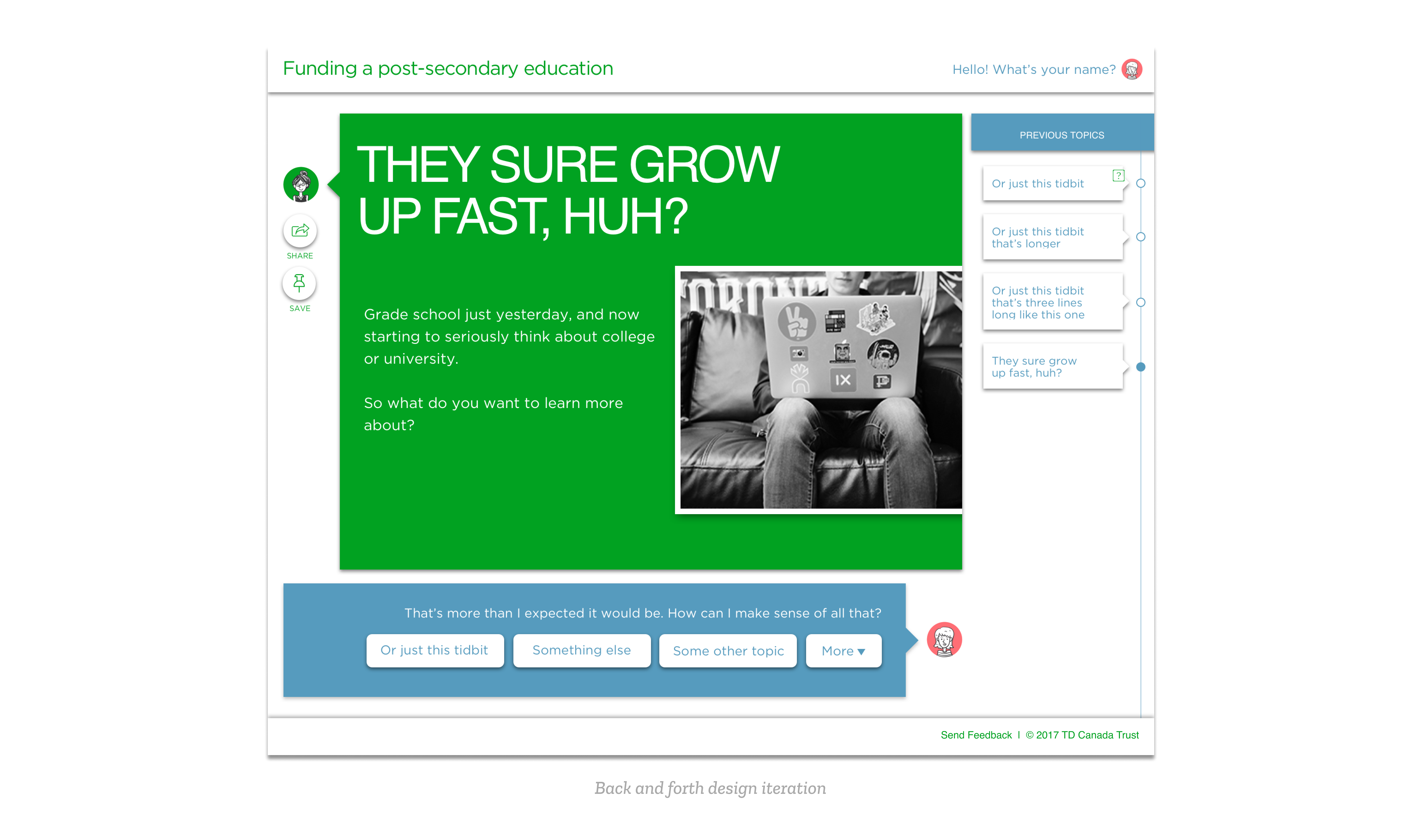
With user testing there were many changes that were made, one of which was to create a back and forth interface (see example below). In addition, people wanted to search through topics, so a search bar exploration was one of the next steps to be designed.
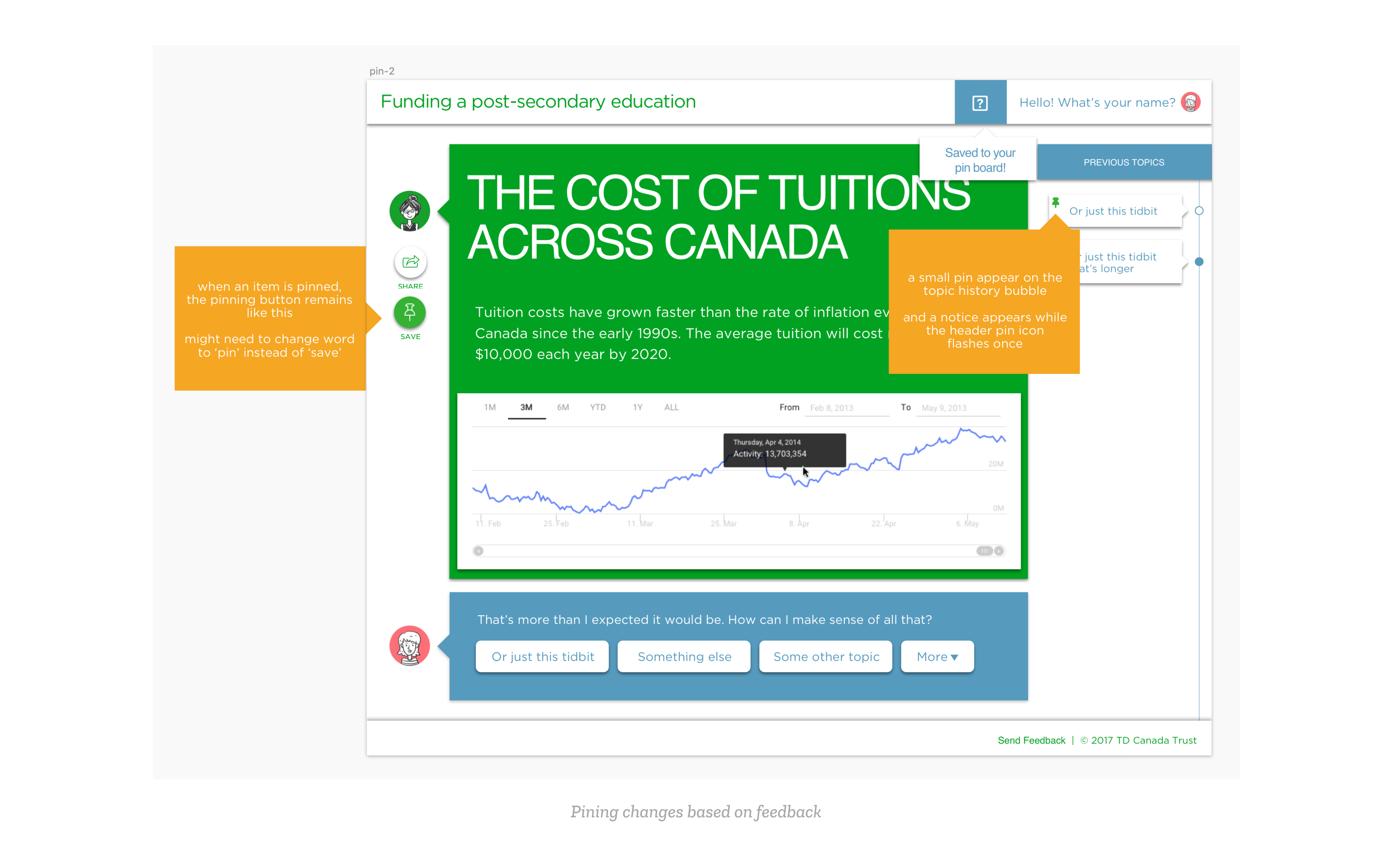
An area of confusion found in user testing involved the 'pinning' feature, as some users did not know what the iconography meant. This is because pinning can act as a 'pin to top' in other digital experiences, instead of a saving action. As a result, more visual feedback on what 'pinning' actually does and where to access these pins were added, as shown in the image below.
Learnings
Overall, this was a brief summary on how the Double Diamond design process is helpful when solving a broad problem. This was my first opportunity to design a product from end-to-end and I learned how important it is to involve stakeholders earlier on in the process with different ideation exercises in order to align on the product goals and their expectations.
I was also reminded that your first idea is not always your best idea, and going through various explorations may be time-consuming, but it is also essential when trying to understand the intentionality behind our design solutions.
I'd like to thank David Janik-Jones, my design mentor at TD, for helping me learn how to be a more process driven designer!