Background
Scotia iTRADE’s onboarding platform is where clients apply for an investment account. There are 3 different new client user flows that the team was designing for:
- Direct Client flow
- Financial Advisor assisted flow
- Call Centre assisted flow
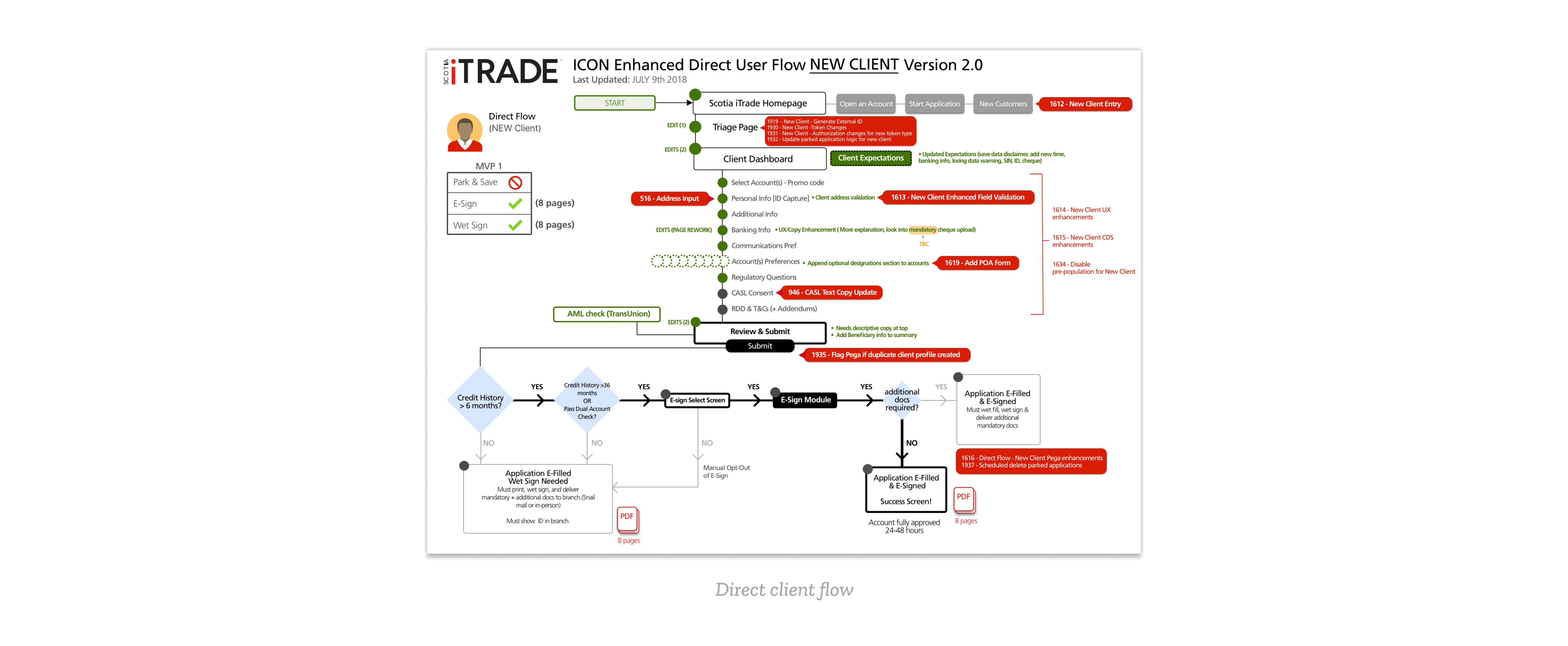
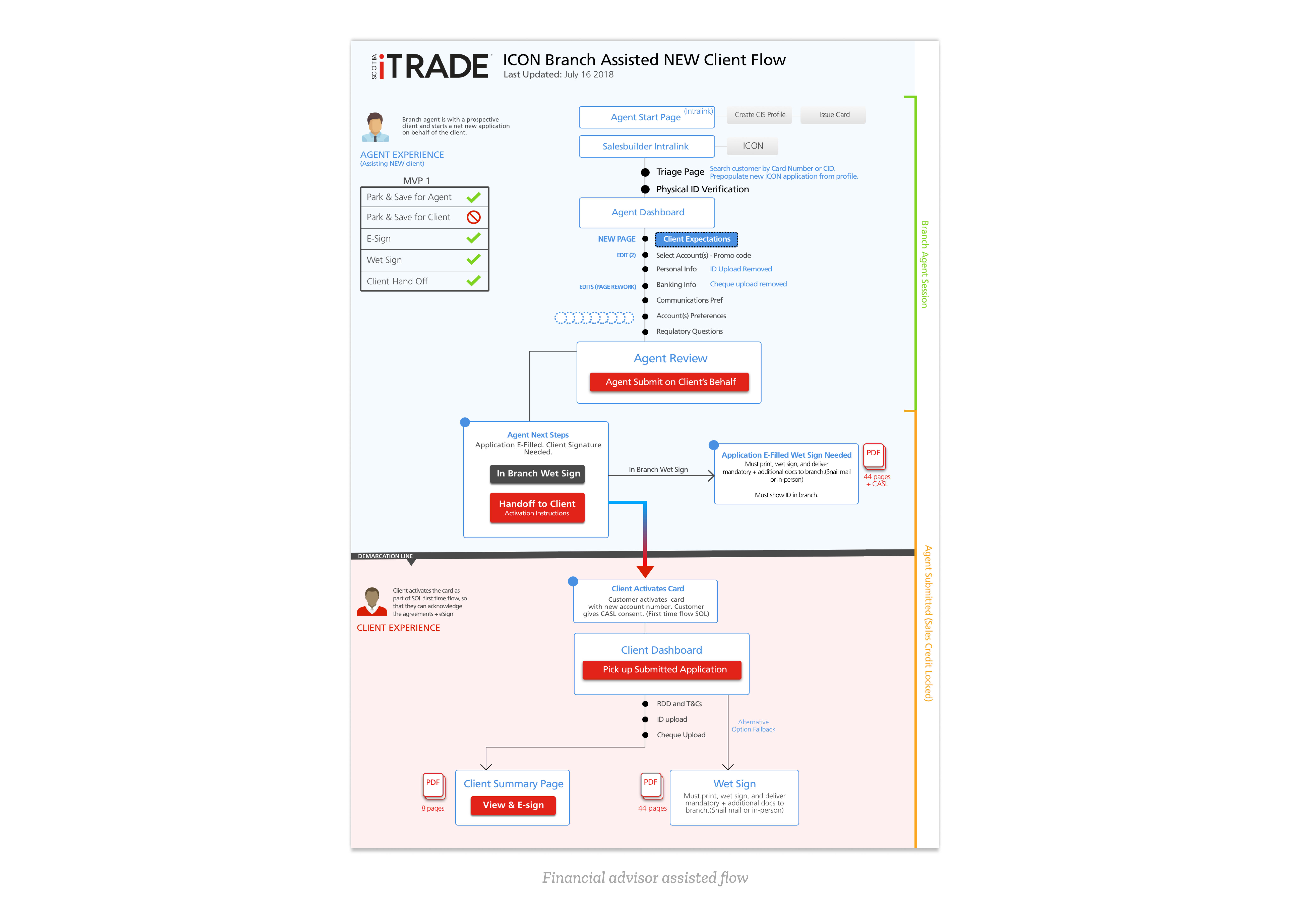
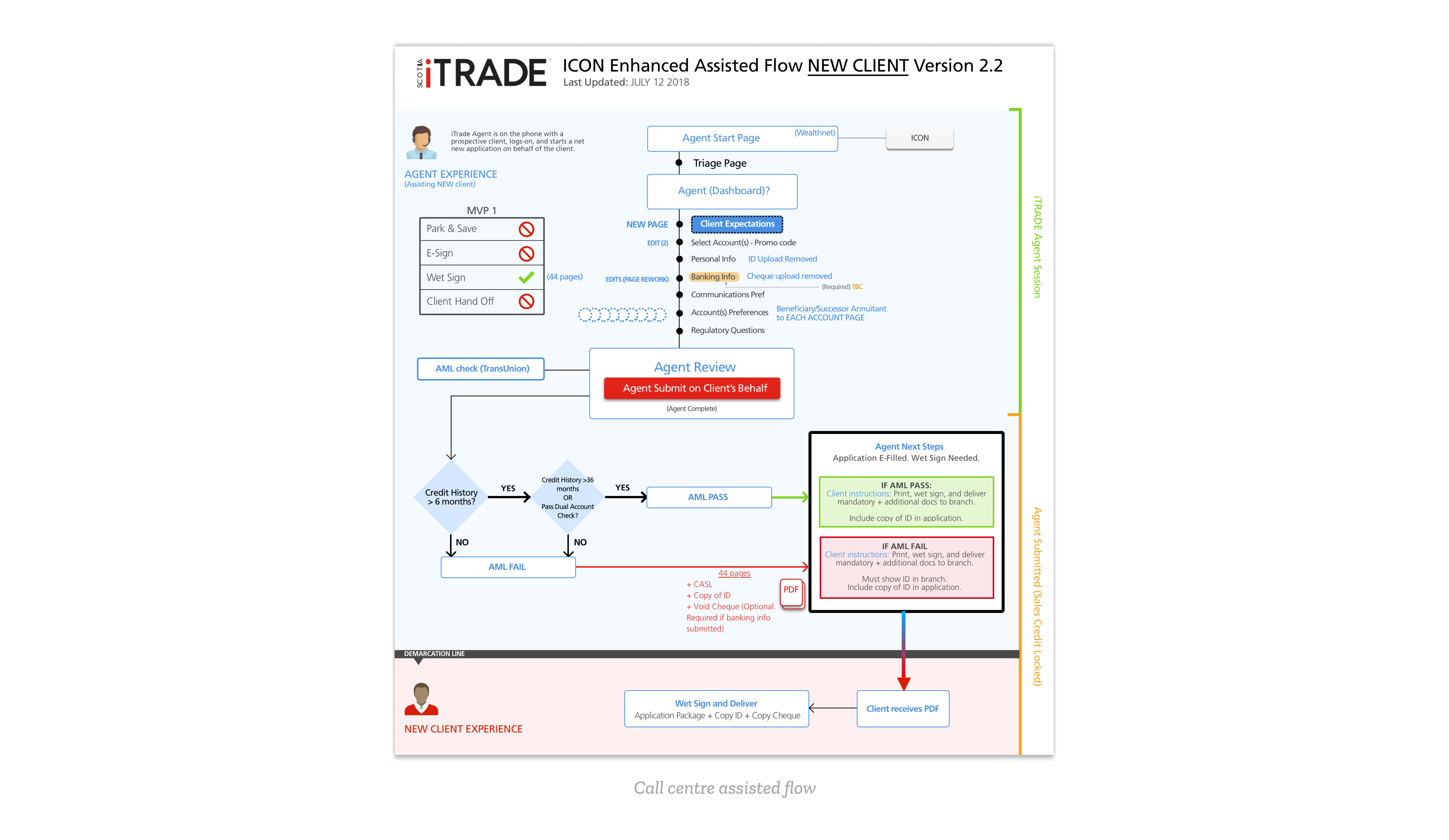
Below are the information architecture flows that I helped organize and design. These flows gave a better understanding for developers and stakeholders of what was planned for the new onboarding interface. The information architecture displayed in these flows were changed several times, and were updated accordingly:
The Problem
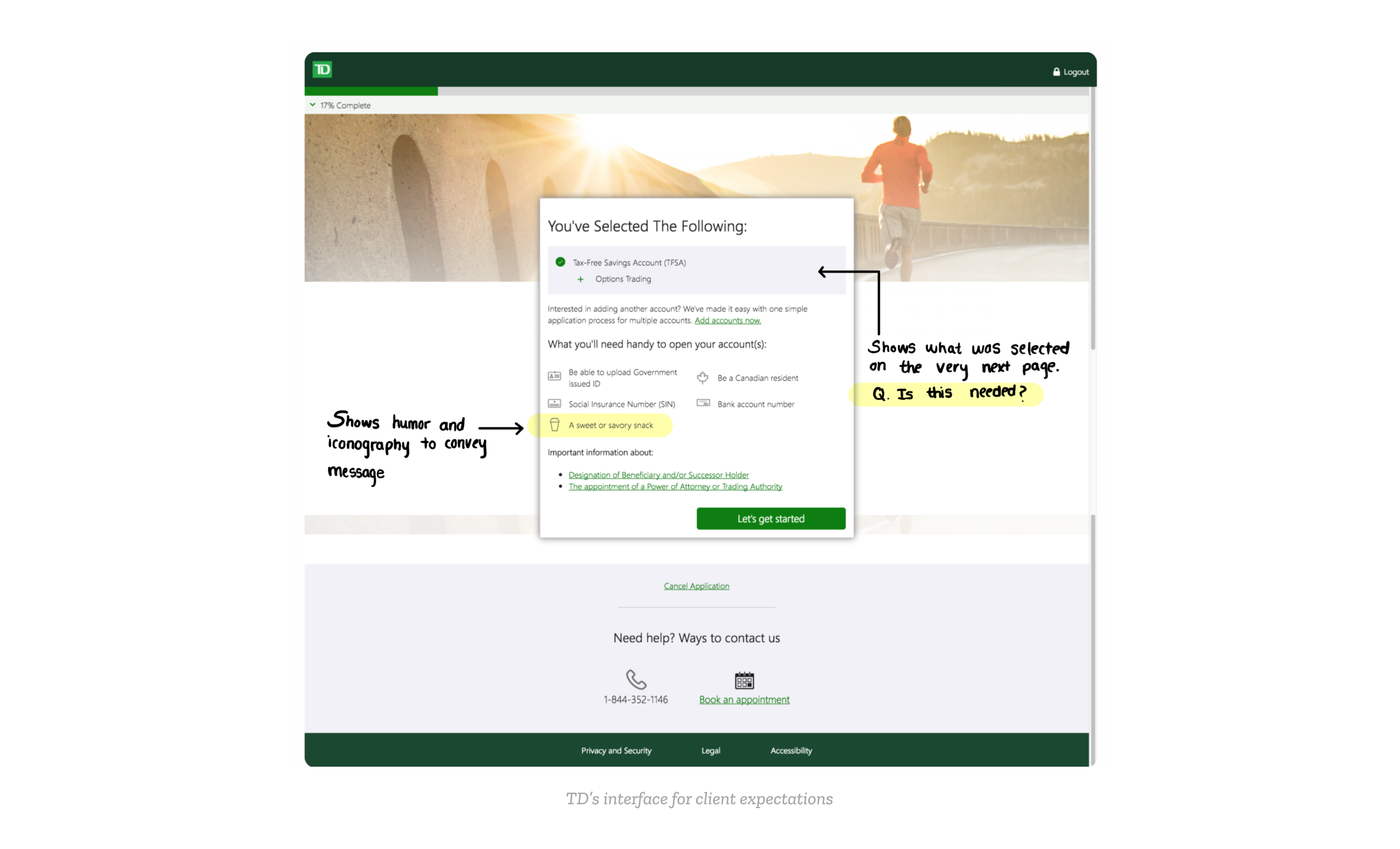
In each flow, there is a Client Expectations section where we advise the user of what is needed in the online application process for a Scotia iTrade account. The old client expectations interface is shown below:
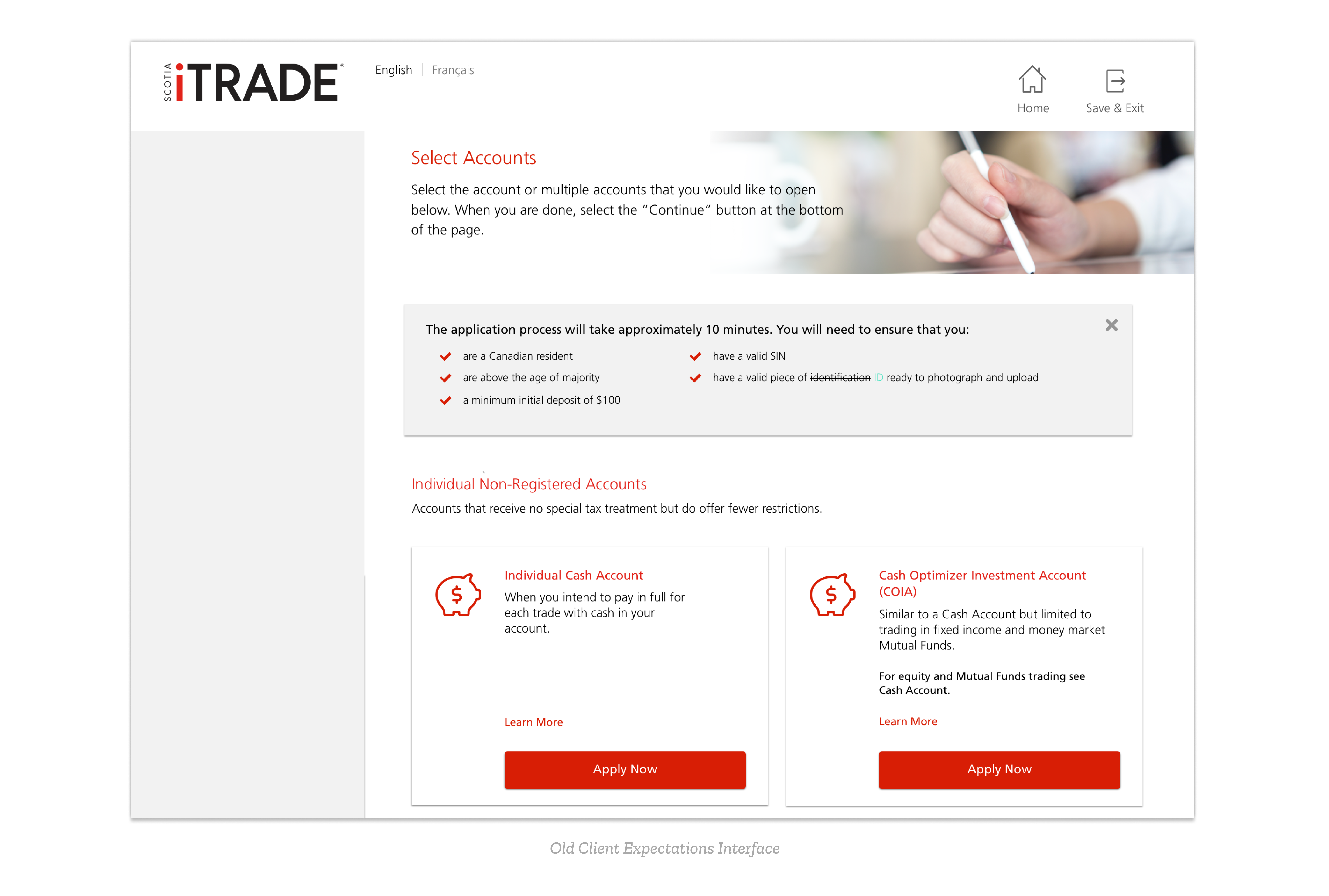
The problem with this client expectations interface is that it's too easy to skim over for something that communicates important information on what the user should have to quickly complete the application process. When I first looked at this screen, I told my mentor/the UX lead that the client expectations screen should be more highlighted compared to what is currently displayed. Knowing that a change should be made, we asked ourselves two questions:
- Should client expectations be a modal or a separate page in the process?
- Should it be before the user selects their account they wish to create or after?
For the first question, much of our decision making came from looking at what other online application processes (and specifically what other financial institutions) are doing.
As seen in the image above, most of them have a separate page for what to expect or bring before beginning the online application. In the context of our Scotia iTrade platform, modal dialogs are used to interrupt the flow in case of an error and to bring immediate attention to that action item. To be consistent, we decided that a modal at the beginning of the process would be inappropriate, especially considering we want the users to feel welcomed as they begin the application.
Design Solutions
The second question was more difficult to answer. If we were to put the client expectations page after, we could provide account specific information that they would need to have during the application. This is shown in the image below:
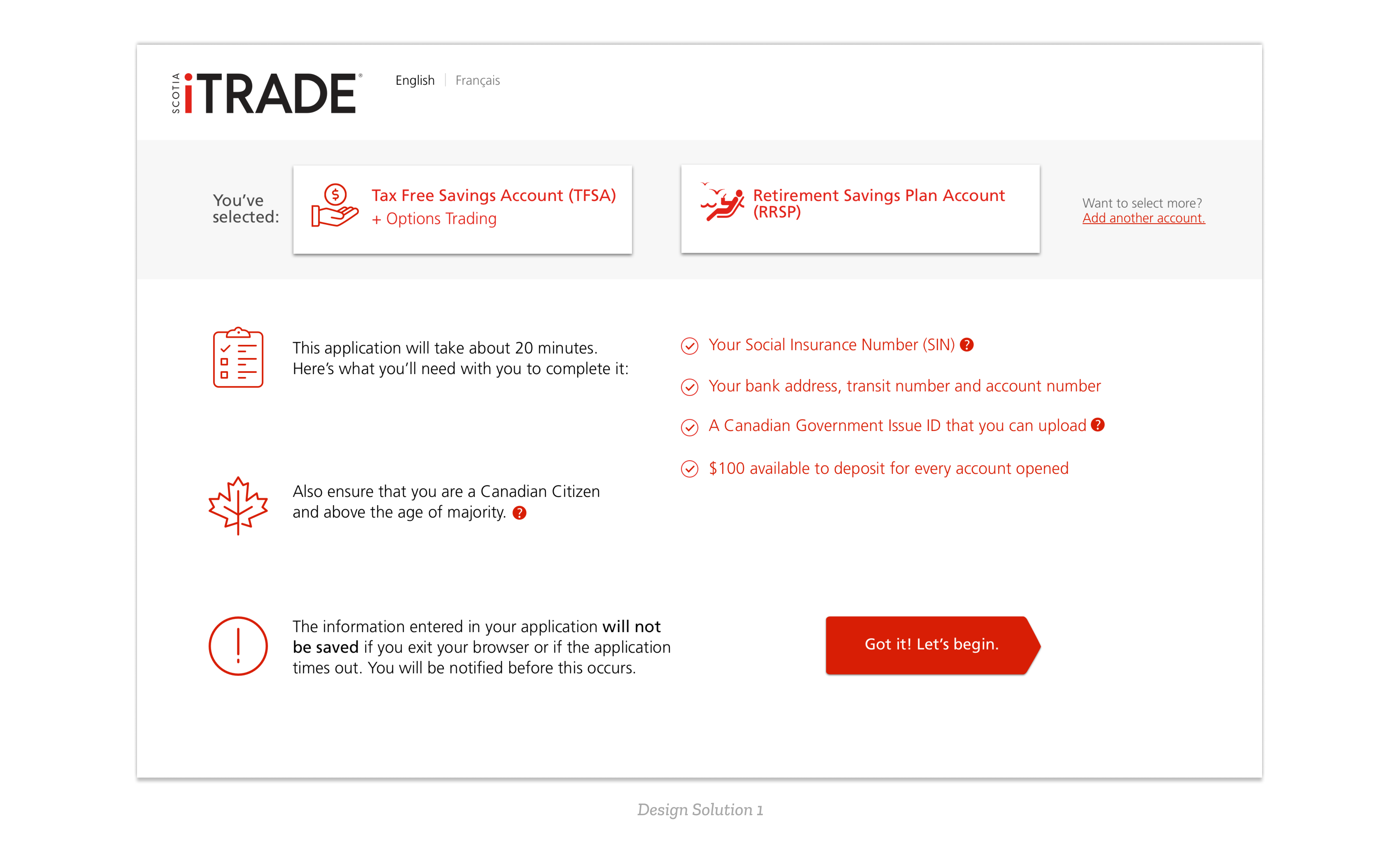
However, the issues regarding the above design is that it could be too overwhelming for users to see all this information, especially considering the ****warning of the application timeout is not distinctly differentiated compared to all the other information the user is asked to check. In addition, because the Select Account page already notifies what the user has selected, there would be no purpose to remind the user on this page.
Iteration 2
In result, we decided to place the ‘Client Expectations’ screen as the first screen that users see when they begin a new application, as shown below:
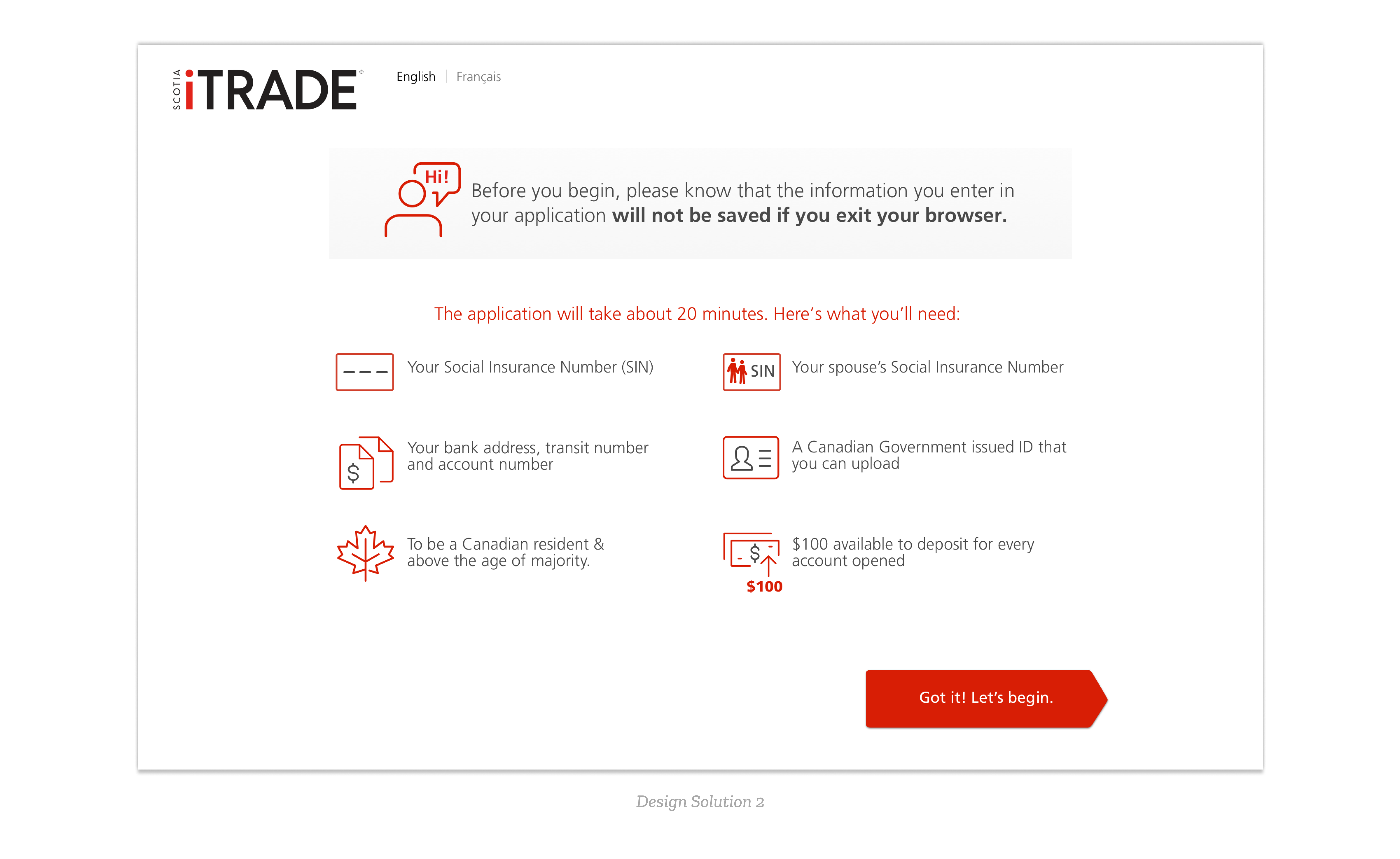
This design highlights the warning message front and centre, as we don’t want users to begin their application without knowing that the information they enter will not be saved. The icons refer to the text beside it, and because they are larger it is easier to see and follow than what was previously designed.
Related Work
If you'd like to see more work that I did in the fintech space for Scotia iTRADE, please contact me